Well, I thought I'd play with the new Core Colors last night, but instead I got drawn in by the next set of In Colors! Above is the color I initially thought I would not care for at all–Blushing Bride. It turns out to be a really nice grayed-out kind of vintage pink. How's that for a description? As soon as I opened the cardstock I immediately wanted to make some vintagey baby girl cards. It looks AWESOME with the color formerly known as Kraft–now renamed Crumb Cake. I had a couple of Kraft corduroy buttons and taffeta ribbon on hand to dress these up a bit.
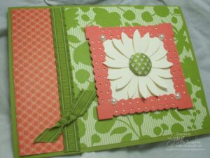
There's a couple of other sneak peeks for you in these photos, too. The stamp set I used is called Printed Petals, and it was given to use on the South Caribbean incentive trip this year. Behind the main flower image is our new gigantic Scallop Circle punch!! Whoo hoo for that baby. The card on the right was also made with the new Vintage Wallpaper embossing folder for the Big Shot. Isn't it too cool? I love how deep the impression is!

Concord Crush proved a little harder for me to use. Imagine the darkest purple you've ever seen, and you've about got it. I will have to play with this one some more and mess with some different color combos. Here's two quick thank you cards I whipped out, also using the upcoming Printed Petals stamp set.
Check out my next post for the remaining colors–Peach Parfait, Poppy Parade and Pear Pizazz!