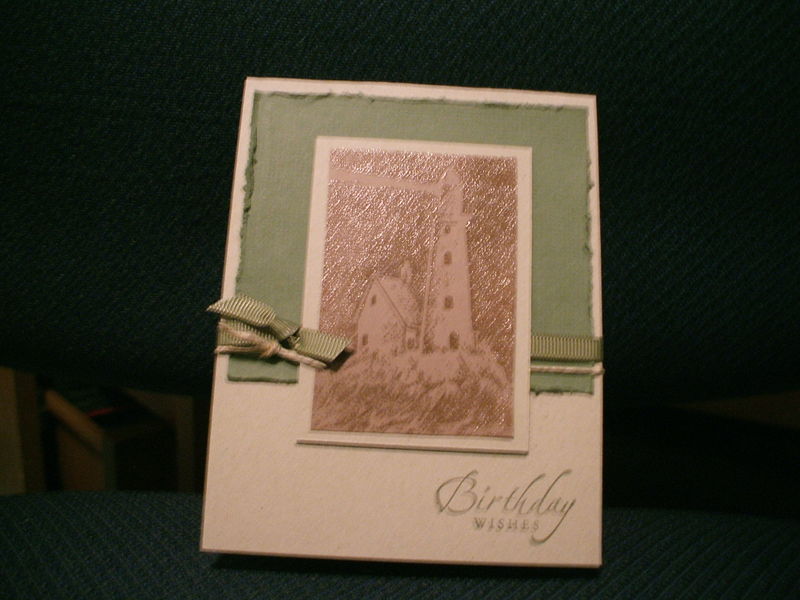
 We had SUCH a blast at the Birthday Bash today! If you weren't there, you really missed out. There were thirteen cards to choose from and people made anywhere from five to fifteen of them.The card above was one of the more popular designs, so I thought I'd share it with you all. It also features two soon-to-retire sets, so if either of them catches your eye, act fast!
The focal point in this card is a cool tone-on-tone look created with clear embossing powder. The image is stamped in Versamark clear ink, sprinkled with the powder (which looks white until it is melted) and then heat set. It melts into a clear, shiny, hard layer on top of the paper, which makes it look a shade darker than the color of the paper. It's subtle and classy–think stamped leather.
Perfect for a masculine card like this one! Ladies tell me all the time that guy cards are so tough to make–well, here's a little primer on what makes a guy card masculine!
I also used Kraft cardstock for a nice NATURAL feel (starting with traditionally masculine colors helps; you can still use some girly colors, even pink, but as accents rather than card bases). Another "nature" element that's so quick and easy is hemp twine. Think ROUGH–the distressing tool of the Cutter Kit adds texture instantly. Narrow grosgrain ribbon, faux stitching or paper piercing can give that masculine TAILORED look. Adding METAL elements such as eyelets or brads or Hodgepodge can also add to the masculinity of a card.
You probably can't tell from the photo, but the Artichoke background has Canvas background stamped on it in Artichoke ink as well. Everything reinforces the masculine "feel" of the card. Next time you're working on a card for a guy, try adding natural elements, texture, metallics or tailoring, and you'll love the effect!


You are SO good at guy cards – I love this and your tips are priceless! Thank you so much for sharing! GREAT card!
I love this, Lyssa! Thanks for sharing the details. Hope you have a great time in Orlando!