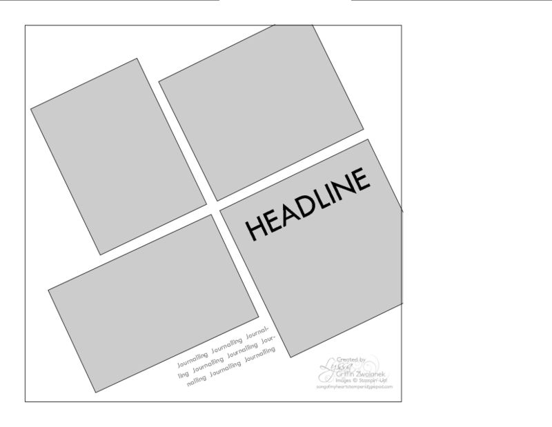
This layout is designed for those goofy photos that got taken at wonky angles, whether on purpose or by accident. The visual grid itself becomes the eye-catcher, so don't go too nuts with embellishments. I see this page with a simple, clean background and all the emphasis on the photos. The headline goes right on top of one of the photos, so use a good strong font and a bold color. Happy Scrappin'!


