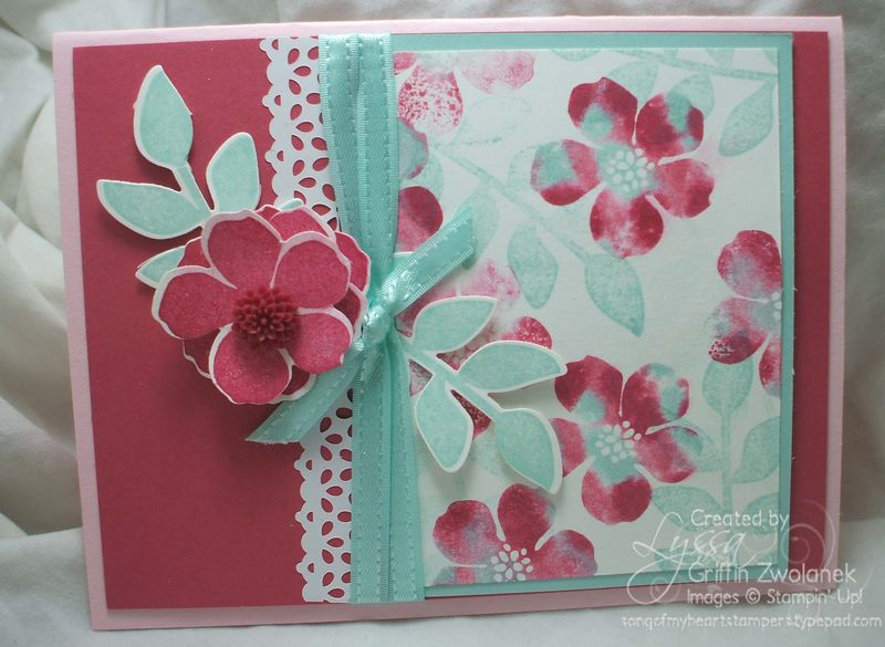
As promised, here's some more cards I made using the technique outlined in the mini photo tutorial from yesterday. I just love the combo of Pool Party, Primrose Petals, Pink Pirouette and a splash of Raspberry Ripple. It's been super fun to have the wonderful Sale A Bration 2013 freebie buttons and ribbons in Pool Party… check them out here, one of the 19 free choices you can select from with every $50 ordered between now and March 22nd!
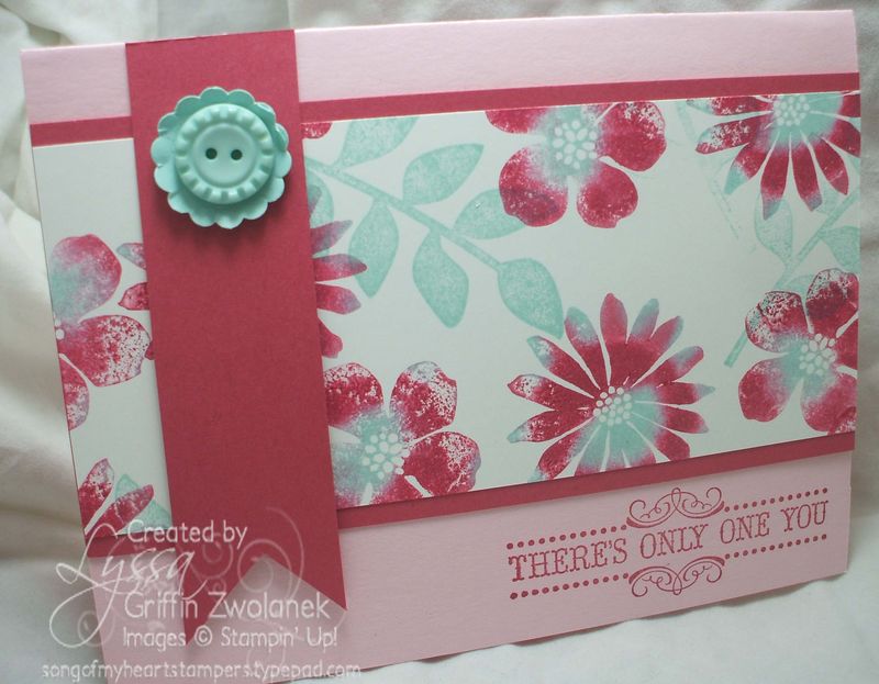
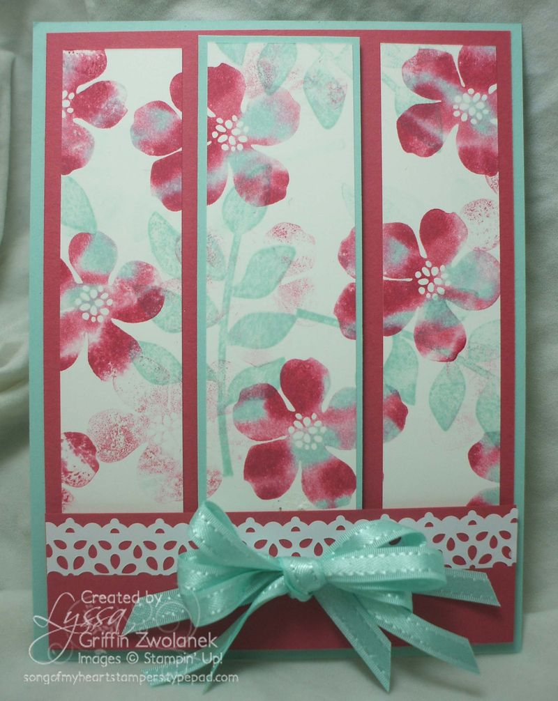
This one above is a bit busier than I normally like to do. What do you think? Too much going on? Normally I go for clean and simple, like this one below… which do you prefer, yourself?

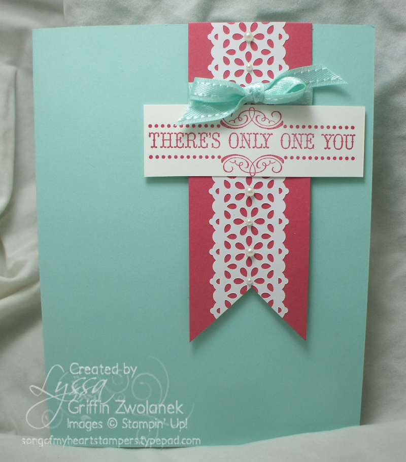


In these samples, I like the clean look better. Maybe the contrast of the two ink colors is too drastic for me?
I like the BUSY one! 🙂 I would probably add a greeting to make it even BUSIER! 🙂
I like the bottom card more than 2nd from the bottom. Maybe take out the blue mat in the middle and it would be ‘better’.
This would work really well for a Triple Time card. (I think)
I like them all! The color combo is feminine yet cheery.
The triple panel one is esp. lovely and would look good with or without the lace tape I think.
The itty bitty pearls on the last one really make the lace tape pop! I think I would try adding ribbon tails to the greeting banner ends to see how it looked.
I like both of them, but I do really love busy cards. I especially like the bow you made on your “busy” card.
The one on the bottom looks too plain, maybe needs another layer. I like the busy one and the bow how did you do that? 🙂
Love love the tulle technique!!!