Spoiler Alert! It's up to you!
Many times, when I'm creating a card, laying out my pieces and playing with placement, I have trouble making up my mind whether the card looks better one way or the other. Should it be vertical or horizontal? Back and forth we go.
I finally get exasperated and glue it down, but later, every time I look at the card, I'll still be wondering if I should have done it the other direction. These are the dilemmas that cardmakers face, am I right?

The truth is, it normally doesn't matter. There is no "right" answer in art. The only "right" answer is to get the card in the mail! Nevertheless, we papercrafters naturally want our creations to look as good as they can. I've written down some tips I've learned over a decade of professional cardmaking to give us some basic parameters for how to choose if a card should be vertically or horizontally oriented.
But first, we have to know our terms! "Portrait" and "landscape" are how professional designers refer to height/width orientation.
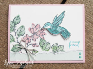
- Portrait orientation refers to a card that has a width dimension smaller than its height dimension. Think of a painting of a person, seated stiffly upright. The first card, shown above, is portrait.
- Landscape orientation refers to a card that has a width dimension larger than its height dimension. Think of a painting of a sunset, wide and low. The second card, shown below, is landscape.

5 Tips Designers Know About Choosing Portrait or Landscape Card Layouts:
- It's all about the words! Landscape allows for a wider, shallower arrangement of your sentiment, while portrait restricts the words to a taller, narrower boundary. If your sentiment has a lot of words, or a long, sweeping font style, it will likely look better on a horizontal layout. Trying to visually squeeze them into a vertical one will look overcrowded. Likewise, a tall, thin sentiment will look awkward and out of place on a long, low card.
- If using a lot of different elements, choose landscape. Research on orientation in design by Wolfe and Horowitz (2004) showed that spreading out the visual "distractors" helped subjects identify the "target" (focal point) more quickly. It was harder on the eye to search out and focus on the important material when there were a lot of elements close together or the elements were very similar.
- Use color to help guide your decision. Does your most prominently colored piece run vertically or horizontally? Match the layout to that piece, no matter how big or small it is. The eye goes first to the color that "leaps forward" the most, and if the length and size of that piece is clashing with the way the card is oriented, it's going to be fundamentally discordant no matter how cute all the various parts are. Not sure which color is the most prominent? Try squinting at the card. One will intensify while the others recede.
- One size doesn't fit all. Ever flipped your smartphone on its side in order to fit more information at once on the little screen? You made a split-second decision to alter the layout in order to meet your needs. That can't be done once a card is adhered together, but if you're struggling with a layout during the pre-adhesive stage, turning it 90 degrees may be the answer. Still doesn't work? Try doing a "mirror image" flip of all your elements. The location of the key "white space" or "resting space" changes with every configuration you try. One of them will most likely be the optimal layout.
- Done is better than perfect. The most important factor in cardmaking is getting them done and in the mail. Every card teaches a lesson, even if it's just reinforcing good design principles we already know and enjoy. Maybe the lesson this particular, imperfect card teaches you is a subtle, even unconscious help towards doing better next time. Every project is another step along the path of developing our God-given creative skills and using them to bless others. Accept imperfection and enjoy the journey!
I hope you've enjoyed today's mini-lesson on good design! You might appreciate the other articles in my brand new "Five Tricks Designers Know" series. You'd also love the design hints and tips I put on every page of my Cheat Sheets cardmaking helpers. Learn WHY things look better placed in certain areas, WHERE color combinations go awry, HOW to cut to make the most of your paper. Good design is within everyone's grasp! Thanks for visiting Song of My Heart today.


Such great information! Thanks for sharing, Lyssa!
Very informative and great to read. Thank you.