I hope you're enjoying and participating in my new blog series challenge, 31 Pages in 31 Days! It's a fabulous way to focus that
mojo that has wandered off sometime in the last couple of years for
many of us. If you're a former, current, or wanna-be scrapper, I
encourage you to play along and challenge yourself to accomplish a
significant goal like this one, one day at a time!
TODAY is the last day to leave a comment and enter to win this week's blog candy, a free pack of 12×12 In Color Assortment Cardstock and a ruffle stretch trim sampler, to boot!
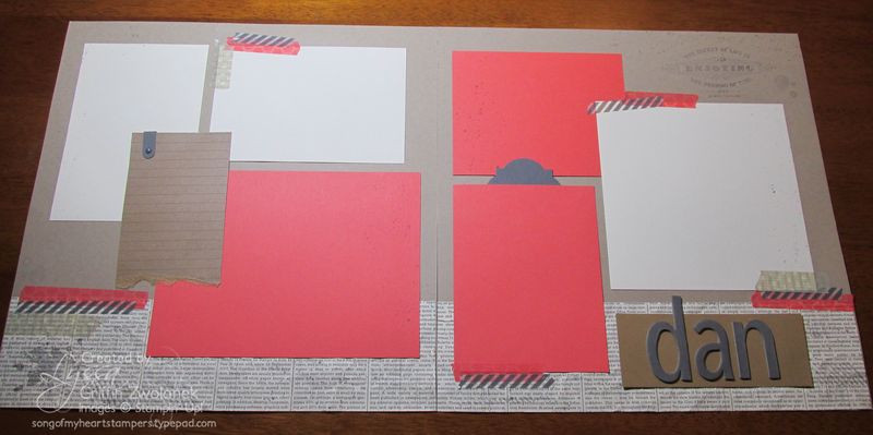
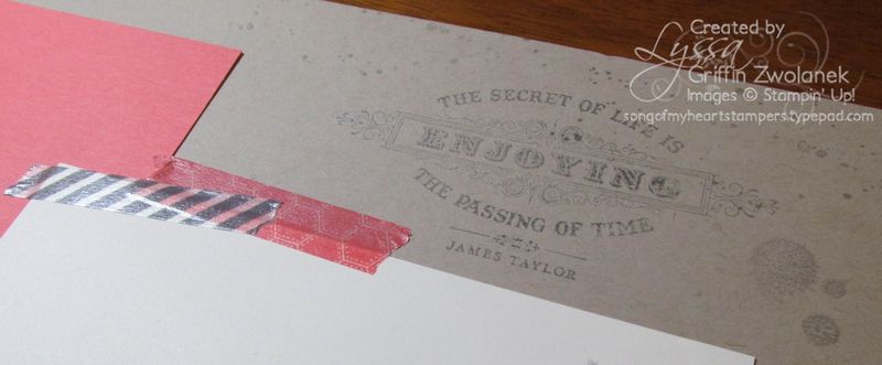
Today's two-page double layout is a spread that we made in Scrapbooking Summer School last night. We used my favorite Gorgeous Grunge stamp set in Basic Gray ink on a Crumb Cake/Kraft background, with a border of newsprint-patterned Designer Series Paper and mats in Calypso Coral and Very Vanilla.I took a quotation stamp from the From my Heart set and stamped off on the background papers to add some subtle interest to the area of "white space" in the upper right corner.
Got questions?
Are you familiar with the graphic design term "white space?" It's the reason professionally designed publications don't fill up every little corner of their page, magazine cover, or add. The blank area actually serves as a way to both rest the eye AND draw attention to the focal point. Have you ever seen a page where you didn't know where to look first? And sometimes white space isn't even white! It can be tricky, but white space is an important concept for budding designers to learn.
I know I sound like a broken record about this, but several commenters have said my combos are a bit bright for your tastes. Remember that 90% of the mat is going to be covered by photos. When there's only a rim of bright color around a photo, it compliments the photo and draws attention to it rather than distracts. It can be hard to visualize that color muted and harmonizing when you scrap backwards like this, until you're used to it, but you can trust me on this one : ) Also, colors are not true to life on-screen, for certain sure! Just something to keep in mind.
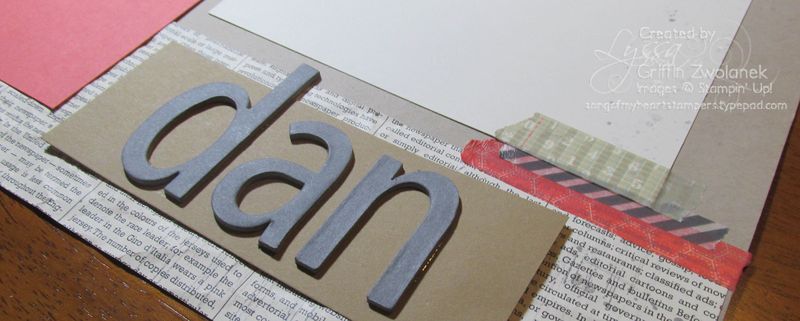
Everyone got to die-cut their preferred title on the Big Shot using chipboard sheets covered with Basic Gray cardstock for an industrial look. It's always so fun seeing what everyone chooses for their headline!
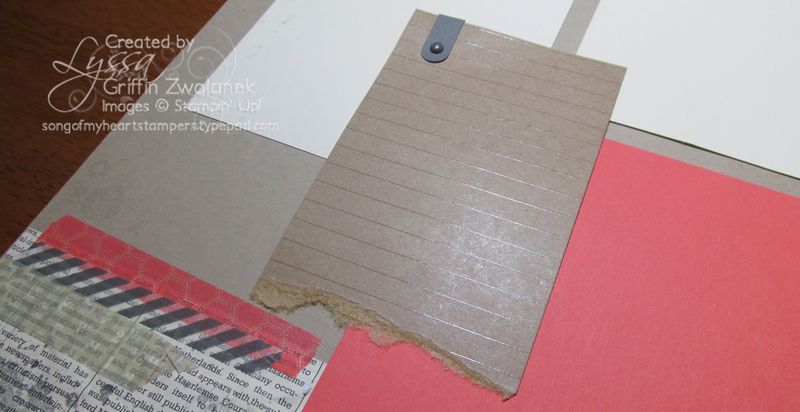
Here's a cool tip for you… the Natural Composition Specialty Designer Series Papers have two sheets that are designed to look like notebook paper. As a whole 12×12 sheet, it's a bit much, but you can make excellent use of that pattern by cutting it up into journalling boxes. The pre-embossed straight lines add texture to the page but help keep your handwriting on track in a subtle way!
Each participant got to take home the whole three-piece set of Epic Day washi tape afterwards, to use on more pages as they work on their challenge at home throughout the rest of the month. Yes, they are SPOILED!! And they know it. They are having a ton of fun, and I hope you are, too!
Now I'm off to go finish up tomorrow's scrapbooking inspiration for you–a teacher-themed Back to School page. There's no use avoiding it–it's right around the corner! What photos do you want to take to document the new school year?



I am not much of a scrapbook-er but I am really enjoying this series. It may even get me back to scrapping.
I love this color combo…and have really loved working with the Naturals Composition paper.
Washi tape = LOVE in my book. Great use of it on this layout.
Love, love, love the washi! This was a fun layout to create – thanks Lyssa!
Love it! Especially the journaling idea. Now I know what to do with that paper. 🙂
I love the inspiration. White (or colored) space makes a huge impact on designs!
Another great layout! I have been doing some scrapbooking on my own, thanks to your inspiration! And, now I will have to get my hands on some washi tape, I love the look! Thanks!
This is one of my all time favorite spreads! I just realized that I forgot to stamp the saying at the tops (oops). The colors are unusual, but I really like it! I am now sold on the washi tape…I resisted as long as I could.
I don’t think it’s too bright at all. You are right, the photos will fill most of the space and what you get is a clean, happy look! Thanks for doing boy pages, too!
Anxious to work on a few pages this weekend from your inspirational posts this week! So glad I discovered your site.
Great masculine design and color palette.