When's the last time you ordered plain black cardstock? Maybe never, right? A lot of people don't realize the importance of black in a world with so many gorgeous colors and combinations. But good old Basic Black plays a crucial role in good design. It's instantly elegantly formal … and simultaneously an authoritative, powerful presence. Learn to correctly use black in your cardmaking and improve your design skills today!
"I've been 40 years discovering that the queen of all colors was black."
Pierre-Auguste Renoir
Here's Five Tips that Designers Know about Using Black!
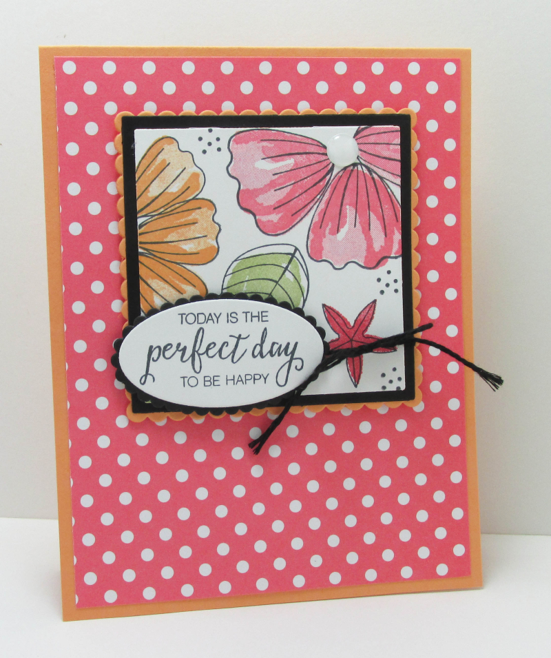
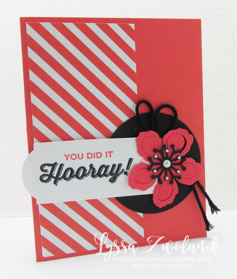
- Black can make other colors POP in a way that white never will.We have a lot of very old woodwork in our little cottage, that has oxidized over time to be nearly black. We thought we'd be stuck with neutrals forever, but vermillion, goldenrod, plum–they all look amazing next to the black. It works on cards and pages just like it does in house design.
- Black is typically used sparingly, for emphasis. It draws the eye nearly as irresistibly as a bold, bright color like orange or hot pink. You can experiment with this by laying out some swatches on a plain surface and squinting your eyes partially shut. You'd think you wouldn't even notice the black, but in actuality the eye goes straight there and only sees the brighter colors peripherally.
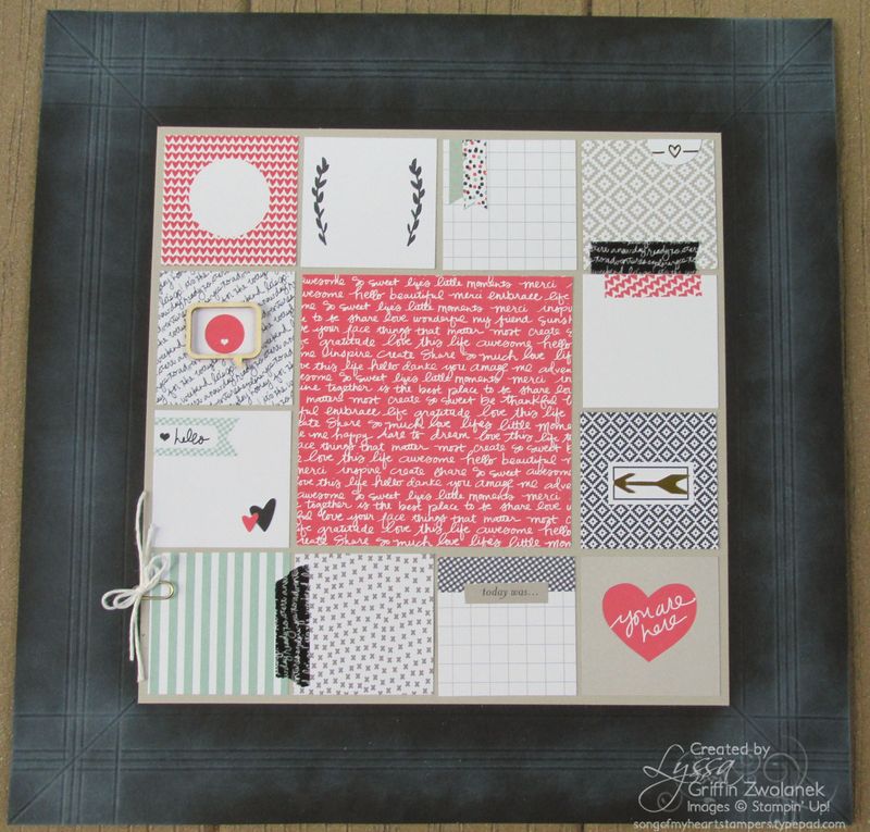
- Black can be super effective as a background color, as long as it's broken up with enough layers on top. Cover at least a third of the scrapbook page or cardfront with your other colors or papers. Subconsciously, you see the black first–so make sure you put clean, compelling design on top of a black background. Too frilly or busy will just cause the eye to divert to the background instead of your focal point or photos.
- Black recedes (pulls pack) from the eye. It will always look like it's retreating, even if it's the top layer. Sometimes that's good, and sometimes it's not, and that will depend on the designer and on the project. In small accent amounts, it doesn't matter. But if you'd layered too much black on top, your project will "fight" against you. There's a reason they say designers "work with" color. They're experienced enough to know when they've placed a color in a position that does not come naturally for it.
- An interior designer once told me that every room needed a bit of black in it, to "ground" the design and provide a frame of reference for all the other colors. I don't know if that necessarily has to be black, especially for cards and scrapbook layouts, but the principle of a deep coordinating shade to ground lighter, "flyaway" colors holds true. Really dark espresso brown, midnight blue, or deep charcoal gray can do the job of black.
I hope you've enjoyed the little insider look into designer tricks of the trade today! My Cheat Sheet Collections are FULL of cool tips and hints like these for making your projects look more professional. Every one of the layouts comes with measurements, instructions, alternate suggestions and design helps. Check them out here on the blog or on Song of My Heart Etsy!
Thanks for stopping in today, friends! Now turn off the computer and go get in the craft room : )


This post is amazing. Thanks for sharing these fabulous design tips. Love your blog; it’s a regular stop on my rounds.